
70% more conversions from one redesigned product page
When your Add to Basket is not working hard enough - you’re losing sales. That was the reality facing Mr Fothergill's, one of the UK’s most loved seed and gardening brands, their product pages had a layout problem that was quietly costing them conversions.
Remarkable stepped in, redesigned their Product Detail Page (PDP), and delivered a 70% increase in conversion rate across their Shopify storefronts. Here’s how we did it.
The Problem: Great Content, Wrong Place
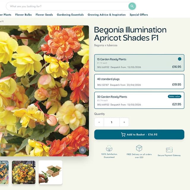
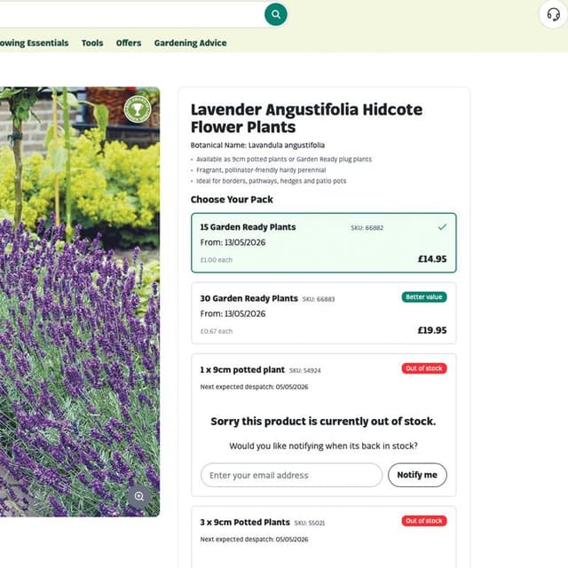
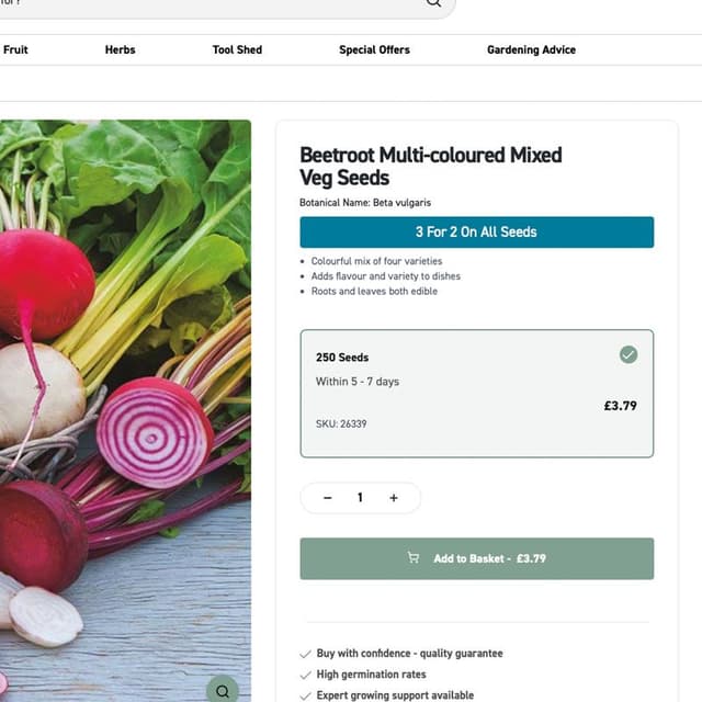
Mr Fothergill's have evolved their PDP layout over time by adding elements like growing tips, sowing seasons, and dynamic data into the buy grid. Useful information that customers genuinely value. However, on products with multiple USPs and more than two purchase variants, this new content was pushing the primary call-to-action, the Add to Basket button - below the fold.
For a gardening brand with hundreds of seed varieties and product types, many of which carry several pack sizes and options, this wasn’t an edge case. It was affecting a significant portion of their catalogue. Customers were landing on product pages, seeing great content, but having to scroll to find the one button that actually lets them buy.

The Approach: Discovery First, Then Speed
We kicked things off with a focused discovery workshop to understand the full picture - what was going wrong, what the team had already tried, and where the biggest opportunities sat. From there, we moved fast.
Within a few days, our UX team had produced an initial concept for a restructured PDP layout that integrated product USPs without sacrificing the visibility of price, variant selectors, and the CTA. We presented it to the Mr Fothergill's team, gathered feedback, and refined the design into a second iteration that balanced information hierarchy with a clean, conversion-focused layout.
The key design objectives were clear:
- Integrate product USPs within the Buy Grid without pushing key actions down the page.
- Keep the Add to Basket CTA above the fold wherever possible.
- Maintain a clear visual hierarchy between price, variants, USPs, and the primary CTA.
- Ensure the layout flexed gracefully for products with multiple purchase options.
Once the design was locked, our development team built it in around two weeks on the Mr Fothergill's custom Shopify theme. A quick but thorough round of QA testing - both internally and with the client, followed before the new PDP was rolled out across all three of their storefronts.
The Result: 70% Conversion Rate Increase
70% more conversions is not a marginal improvement. A fundamental shift in how effectively these product pages turn browsers into buyers.
The impact was noticed right away - not just in the analytics, but at board level. As the team put it:
This has been noticed and we have mentioned this to the board. Excited to see what the second phase of PDP changes brings. The team have done an excellent job with design and dev!
Mr Fothergill's team
Why It Worked
The implementation strategy wasn’t a complete page rebuild. It was a precise, surgical intervention - identifying the opportunities that were silently killing conversions and fixing it properly. The reordering and restyling of content gives the customer a cleaner journey. The information customers need is still front and centre. But now, so is the button that lets them act on it.
It’s a perfect example of how smart UX design, grounded in real data and a clear understanding of the customer journey, can deliver outsized commercial results without a massive scope or six-month timeline.
Built for Speed, Designed for Growth
At Remarkable, our agile approach to project work means we move quickly without cutting corners. From discovery workshop to live deployment, the entire Mr Fothergills PDP project was scoped, designed, built, tested, and rolled out in a matter of weeks.
We’re becoming increasingly technology-agnostic too - whether you’re on Remarkable, Shopify, Magento, a headless stack, or something else entirely, our focus is on building customer experiences that deliver real, measurable conversion rate growth. The platform is the means; the results are the point.