
This Year’s Popular eCommerce Features
Following on from the article ‘Our Favourite eCommerce Designs of 2019’, we now dig further into several of this year’s most popular eCommerce features. These features are crucial in maximising a website’s full potential while also ensuring a positive customer experience. In this article, we highlight ten of the most popular eCommerce features that are a must when developing your website to attract potential customers.
We will explain the purpose of each of the ten features while using case studies of our own clients along with other high-profile brands across a variety of industries.
Let’s kick things off with the importance of having a customer log in.
Customer Log-in
This may seem like an obvious feature, but obvious or not, it’s something that remains vitally important. When purchasing items, most websites provide the option to either sign up for an account with the respective company or simply ‘checkout as guest’. You will receive a different experience depending on which one you choose, and both have their own pros and cons.
Allowing the option to checkout as a guest is essential as it can be the first contact a potential customer has with your website. With it being the first contact they have, the chances are they may not initially trust your site enough to readily hand over their personal details. Although this approach reduces the number of clicks and makes for a quicker experience, it does have several disadvantages:
Not being able to send out newsletters and promotions to customers
Guest customers are unable to easily re-order products
Inability to request reviews after purchasing of an item
Customers can have difficulty tracking or modifying orders
Inability to link a customer’s order history
Customer services may find it more difficult and time-consuming to assist a customer with their order
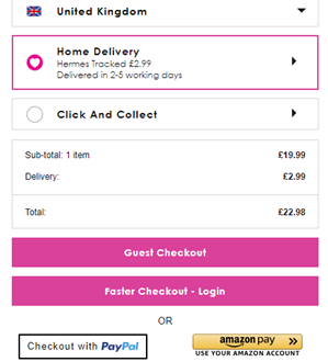
Alternatively, registering for an account can provide customers with a more interactive and interesting experience with the respective merchant. Registered accounts allow for features such as those mentioned above which create an authentic relationship between the customer and the merchant. This is a clear sign of trust and therefore increases the chances of a customer returning to use the respective merchant for products while also actively seeking their latest news and offers.
These options both serve a significant purpose. Initially, you would expect a new customer to ‘checkout as guest’ to see if the service they receive meets their expectations. Once this has been achieved, the merchant’s goal is to sign them up to the website; using a variety of techniques such as offers and potential prizes as an incentive. Above all else, the key is to make the sign-up section as clear as possible to ensure that registering is a straightforward process.
Examples:
yoursclothing.co.uk bewleyandritch.com
Special Offers
Who doesn’t love a bargain, right? Let’s be honest, everyone wants to get more for their money – and businesses are aware of this.
A sales offer is a proven strategy to improve sales, acquire new customers and make the most of seasonal opportunities. Quite often, these sales offers are a short-term marketing tactic in order to create a sense of urgency amongst the target audience to fear missing out, and in turn, increase sales. This can be achieved through a variety of sales types, which we will focus on with accompanying examples from a variety of case studies.
Buy one, get x
This is one of the more common special offer approaches. This can be used in a variety of discounts, but the most common two are ‘buy one, get one free’ and ‘buy one get on half price’. As this is a classic case of getting more for your money, it is extremely popular among customers. The example below shows an example of the latter.
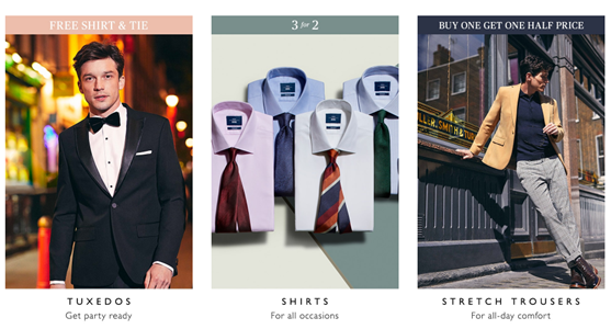
In the example above, Moss Bros have a section of their latest offers, one of which being ‘buy 1, get 1 half price’ (known as BOGOF deals if the second product is free). This is in relation to their selection of stretch trousers, where, if you buy one pair, you can buy a second pair for half the price they are retailed. This is a great campaign as Moss Bros are well known for their quality tailoring, so having the chance to get a pair of their trousers for half the price is very desirable to the respective customer.
Flash sales
A flash sale essentially offers a type of saving over a short period of time. The most effective flash sales are those that create urgency and lead to a direct increase in sales.
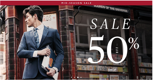
The above is a great example of a flash sale. Moss Bros have used a clear image alongside the large ‘sale up to 50%’ text to make it clear as to what is being offered. This, along with the ‘mid-season sale’ creates a sense of urgency as there is only a short window to make the most of this offer. The simplicity of the design doesn’t make it look cluttered, meaning that it is easy on the eye and therefore simple to take in all the information.
Tripwire
The idea of a ‘tripwire’ is that an offer of a lower, entry-priced good is made to a potential customer in an attempt to get them into the respective merchant’s customer ecosystem. Once this has been achieved, trust can then be built between the business and the customer, making it more likely that the customer will return to purchase higher-priced goods.
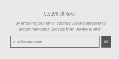
The above example from Bewley & Ritch provides a great insight into the ‘tripwire’ strategy. Here, they are offering 20% off all their ‘new in’ products in return of the potential customer’s email address. This is an enticing incentive as it’s a quick and simple task to save money on Bewley & Ritch’s newest products. Also, once the customer sends their email address over, they are agreeing to be sent marketing updates from Bewley & Ritch. These emails will no doubt include other products at full price and providing that the customer enjoyed their discounted products, will be more willing to pay full price in the future.
Coupon code
Coupon discounts are an effective strategy to get people to buy products while still seeing healthy profit margins. These are most commonly used to sell overstocked items or to upsell other complementary products.
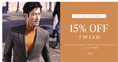
The above is a great coupon example. Moss Bros have used a clear image of a tweed jacket to reinforce what is part of the ‘15% off tweed’ special offer along with how much you will save. This, along with the ‘limited time only’ creates a sense of urgency as there is only a short window to make the most of this offer. The simplicity of the design doesn’t make it look cluttered, meaning that it is easy on the eye and therefore simple to take in all the information. The coupon code is also clear to see, which can be used to retrieve the 15% discount.
Free samples
In some instances, free samples may be offered. This is most commonly used by stores that specialise in decorating products such as paint and wallpaper. These free samples provide the opportunity for the customer to test the sample of a product before committing to buying it outright.
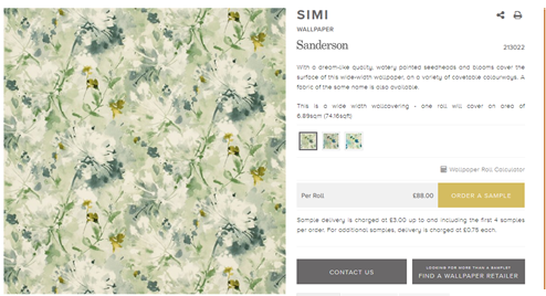
The example above shows a wallpaper product offered by Style Library. Here, you will see the gold styled ‘order a sample’ button on the right-hand side, which allows the potential customer to order a small sample of the wallpaper. This is a great strategy as the potential customer will be able to see the wallpaper pattern in person before deciding on whether they want to buy the product in its full form. Free samples are an effective way of allowing customers to engage with your product in person, which makes it more likely of them to buy the product.
Examples: bewleyandritch.com moss.co.uk stylelibrary.com
Related Items
When developing your website, you will want to have an idea of the ‘customer journey’ and where this will take your potential customers. A strategy to achieve this is by implementing ‘related items’ sections on your product pages. Putting this into practice, when a potential customer lands on a product page, there will be a related items section either at the side of or below the main product to either complement the main product or complete the attire in its entirety.
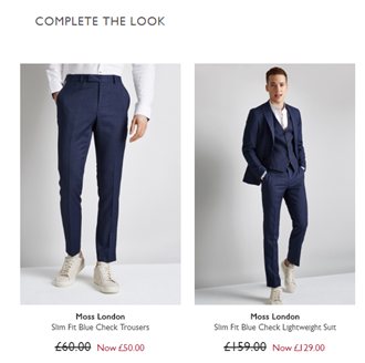
The above example is from Moss Bros once the potential customer lands on the ‘Moss London Slim Fit Blue Check Waistcoat’ page. Below the main image is this ‘complete the look’ section, which provides the option to buy a 3-piece suit, which also has a discounted price. This is a great incentive as it gives a visual example of how the suit could look and is an impressive offer with a discounted price.
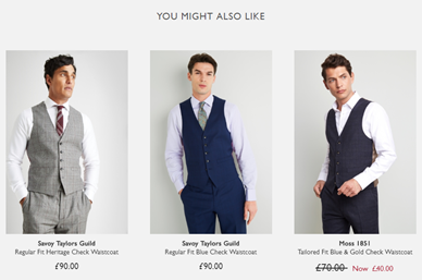
Additionally, underneath the ‘complete the look’ section is a separate ‘you might also like’ one. This differs as rather than offering complementary items to the waistcoat, it presents other waistcoats in alternative colours and styles. The idea here is to provide the potential customer with other products which may take their interest and increase the probability of them making a purchase.
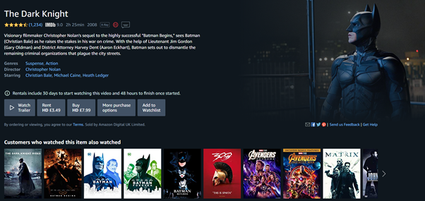
Another example is brilliantly utilised by Amazon. Rather than put forward other products Amazon think that their customers may enjoy, they provide ideas of related items that they know their customers have also purchased. In the example above, if you were to land on the product page for the movie ‘The Dark Knight’, you will see a ‘customers who watched this item also watched’ section which highlights the prequel, sequel and other films that previous customers have also purchased.
In addition, the Remarkable Commerce Manager is available to assist you with a variety of features of your website, including related items. This suite of optimisation tools that enables users to fully control and transform eCommerce experiences. We use intelligent algorithms to predict what the customer is looking for, which allows you to make an informed decision on which products to use as related items.
Regardless of which approach is used, all are effective as it allows the customer to potentially continue their customer journey, which enhances the likelihood of them making a purchase.
Examples: moss.co.uk www.amazon.co.uk
Wishlists
Wouldn’t it be ground-breaking if we were able to make a list of items we’d ideally want to buy without putting them into a shopping basket? Well, with the ‘wishlist’ option, this is a reality. Many retail websites have a wishlist option on each product page which automatically places it into the wishlist section for as long as you wish. This essentially works as a bookmark to save a product to potentially buy later.
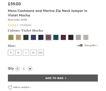
The screenshots above are courtesy of Woolovers, which provide an insight into how this method is put into practice. The first image shows a product page which has the ‘add to wishlist’ option at the bottom of the page. If the potential customer was to click on this, their product will be saved into a list which can be seen in the second screenshot. This is handy for a variety of reasons, such as waiting for payday, accumulating gift ideas for a Christmas or a birthday or simply saving items with the intention of buying in the future. This is a must-have feature on any retail eCommerce site, especially as it is widely believed to substantially increase conversion rates.
Social Share Buttons
Social share buttons allow customers the opportunity to share their purchases via social media platforms such as Facebook, Twitter and Pinterest. As the vast majority of shoppers use at least one form of social media, this is an effective eCommerce feature for a company to promote themselves for free through their customers. This feature is usually included on product pages to bring attention to these items. As customers share their experiences, it acts as a trust signal to other potential customers as it is an endorsement of the respective company’s trustworthiness and professionalism.
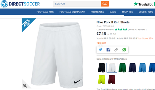
The example above courtesy of Direct Soccer shows how this has been utilised to excellent effect. The screenshot demonstrates a product page – in this case, ‘Nike Park II Knit Shorts’ – which includes social share buttons on the right-hand side including Twitter, Facebook, and Whatsapp and a button that simply allows you to copy the link. This allows customers to share what they have purchased or are thinking of purchasing for others in their network to see. Also, as Direct Soccer has chosen two of the most popular platforms in the form of Facebook and Twitter, the chances of these products being seen via social media are high. These are smart choices of social share buttons as the demographic of Direct Soccer customers are likely to be of a younger generation, who are more likely to use at least one of Twitter, Facebook and Whatsapp.
While social share buttons can be an effective approach to use, it is important to take the following into account if you choose to include them:
Test appropriately
– A/B testing allows business owners to discover the best location for buttons on their product pages and whether they are effective. This testing approach will provide a clear insight into whether social share buttons contribute to a better conversion rate on your product pages.
Prioritise sales over anything else
– Although social share buttons are designed to increase the conversion rate of your website, you must be mindful that they don’t interfere with the customer’s purchasing process. A good tip is to ensure that the buttons are small, as larger buttons can be distracting and therefore potentially disrupt the customer from completing a purchase.
Remove share counters
– unless your share counters are high, it would be highly recommended that you remove these from your buttons. A low number of share counters could potentially look suspicious and untrustworthy, which can damage your brand.
Examples: www.directsoccer.co.uk
FAQs
Sometimes you can visit a website and require information such as how to perform certain actions, find specific locations or have queries about products. For these reasons, it can be a game-changer when a customer finds an FAQ (frequently asked questions) section to answer these questions to allow them to continue their customer journey and potentially make a purchase.
For this reason, all websites should ideally have an FAQ section – especially if the respective business sells niche products. As readers tend to have short attention spans, it is essential that you are able to fully explain any issues that may arise to ensure your potential customers don’t bounce from your site. For this reason, it is well worth writing up questions and answers that your customers may ask. A good start may be to look through your emails to detect any recurring themes in terms of queries to get an idea.
In order to ensure that you write up an effective FAQ section, you should take the following into account:
Write relevant questions
– Seems obvious, right? However, it is vital to take a step back and look at your website from your customer’s perspective. Make a list of questions that you would want to know if you were a customer and include informative answers that are clear and concise.
Keep it short and sweet
– As has already been mentioned, attention spans are short, so it is imperative that you keep your questions and answers brief and to the point. If your answers are too wordy, it could lose authority and lead to your customers losing patience with your website.
Always sound positive
– Always adopt a confident tone when writing your questions and answers. As the idea behind FAQs is to provide solutions to problems, anything other than a positive tone could scare your customers away. Confidence is key.
Include contact information
– Sometimes there may be a customer who has a unique question which you may not have initially thought of. For this reason, it is always a good idea to include your contact information at the end of the page so they get in touch and ask you directly.
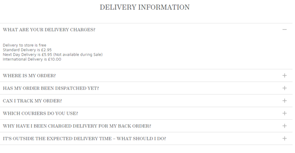
The example above from Fat Face shows their FAQ page which breaks down customer questions and answers into sections. In this screenshot, we see the ‘delivery information’ section has related questions to delivery, with the top drop-down providing an example of a brief question and answer which is short and to the point. This is easy to use, short and provides the customer with all the information they need on this topic. As these FAQs cover a range of topics, they will keep potential customers well informed.
By using the Remarkable Commerce Manager, you have the ability to build pages and create custom content for any area of your eCommerce store, which includes an FAQ page. As these pages can be designed to your liking, you will be able to include whichever questions and answers you wish, while implementing an appropriate overall design.
Mobile-Friendly Website
This is one of the first features you want to take into account when developing your website. More and more people are using their mobile devices to purchase items online, so much so that it is believed that mobile shopping accounts for approximately 50% of online transactions. Due to this consumer online behaviour, your digital marketing strategy must adapt to accommodate this – meaning that you must optimise your marketing campaigns for mobile consumption. A mobile-friendly website is essential.
Taking the Remarkable Commerce Manager as an example, it allows the user to manage different viewpoints and sizes of content within the CMS, making smoother journeys for your mobile users.
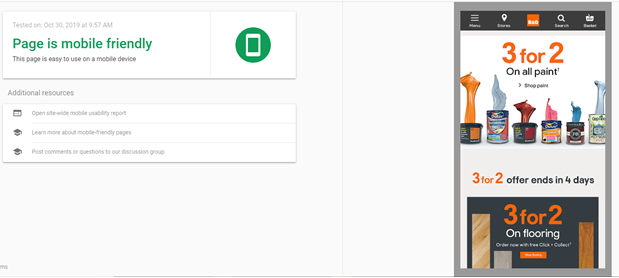
The above screenshots show an example of B&Q’s mobile optimisation, which has been deemed ‘mobile-friendly’ courtesy of Google’s ‘Mobile-Friendly Test’. In terms of being mobile-friendly, it essentially means that a website looks and functions well on a mobile device such as a smartphone or tablet. This example, therefore, meets the following criteria:
The website is clear and easy to read – B&Q’s website is simple to read due to the size and colour of the font, white space and images which all work together cohesively. There is a clear structure with the header at the top which includes the main menu and then the special offers below this.
The website is attractive to look at – The features highlighted in the previous point also make the website attractive to look at via mobile device. These aspects, along with the variety of colours used in the text and the images highlight key information that B&Q want to convey e.g. ‘3 for 2…’, which makes for an enjoyable user experience.
The website is easy to navigate around – The main menu clearly states the options which include ‘menu’, ‘stores’, ‘search’ and ‘basket’. These buttons and links are large enough to easily and accurately tap with your finger, which makes it simple to navigate around the website and find the product(s) that you are potentially looking for.
In order to achieve a website that is as effective as B&Q via mobile devices, we recommend you stick to these 5 steps as guidelines:
Make your website responsive to devices
– Make your website responsive so that the layout and display of the page automatically change in response to the size of the device screen.
Ensure the font is easy to read
– You should take great care in making sure that you choose a font and font size that is large and clear enough to be read from a smaller screen.
Ensure the buttons are larger
– If your buttons are too small, your customers won’t be able to click on them with their fingers.
Make it simple to find important information
– Prioritise what information should be placed in certain locations. You want scrolling to be to a minimum, so it would be a good idea to put your most important information toward the top of the website.
Compress images and files
– Large images, files and videos can slow down your page speed. If this is the case, your customers may grow impatient and bounce from your site.
Above all, a top tip is to plan your website with mobile optimisation at the forefront of your mind. If your website ticks all of the boxes for the mobile experience, everything should also fall into place for the desktop as well.
Example: diy.com
Security Features
Last but not least, make sure that your website is secure. E-commerce security is a set of protocols that protects e-commerce transactions from threats such as credit card fraud, scamming and malware. You haven’t come this far for an unpleasant hacker to destroy what you’ve worked so hard to build! You wouldn’t leave your house keys in your front door, would you? Well, not putting sufficient security features into place is almost as foolish.

While there has been an increase in consumers buying products online, the trend of online threats has also increased. For this reason, potential customers are wary about purchasing online, especially if it is from a company that they have previously been unfamiliar with. It is therefore vital that eCommerce security features are clearly put in place for them to clearly see that you are safe and secure. Failing to achieve this minimum requirement could lead to your customers being scammed, which will leave you with a severely damaged reputation and very little custom. However, you’ll be pleased to hear that this is very avoidable.
If you are to ensure that your website is safe and secure, we strongly recommend that you follow these 5 essential e-commerce security features:
Use HTTPS
Take a look at your website. It will either show the grey ‘http://’ or green ‘https://’. If you have the latter, then fret no longer, however, if not, then you will have some work to do. HTTPS is the protocol to transfer data over the web and should ideally be used over HTTP on all pages where data is created as it allows for it to be encrypted. HTTP does not encrypt data which can lead to someone intercepting it and reading what has been sent. Customers have now become aware of this, which means that they may choose to actively avoid sites that continue to use HTTP. For this reason, persisting with HTTP can have a negative impact on your site – even without the assistance of a hacker!
SSL certification
An SSL Certificate encrypts sensitive information to ensure that any data is unreadable to everyone other than the destination server. Due to the fact that customer data – such as credit card details – are passed through multiple computers before reaching the destination server, choosing not to have an SSL Certificate can lead to this information being stolen.
Scan for malware
It is advisable that you regularly scan your website for malware. This will identify any harmful code on your website that has been placed by hackers.
Monitor your site
By frequently monitoring your site, you are able to successfully identify any potential hacking activity and keep it out. This prevents any loss of data and information theft which can damage your security reputation and customer confidence.
Ask for a CVV number
A CVV (Card Verification Value) is the three or four-digit number on the back of a credit or debit card. If a hacker manages to steal a credit card number but not a physical card, a CVV requirement will make it much more difficult for them to complete a fraudulent transaction.
By taking the steps above, you will lay the foundations for your customers to safely use your website and essentially trust your brand.
Why Choose Remarkable?
Are you looking for professional assistance in designing your website and to implement essential features such as those highlighted in this article? We are a specialist eCommerce software vendor with a highly experienced team of developers. Established in 1999, our track record has proven that our expertise achieves outstanding commercial results as we work with some of the most prestigious names in the retail industry including Moss Bros, Jeff Banks and Style Library.
Take a look at the Remarkable Commerce Manager, to see the wide variety of eCommerce features and functions that are available with our tailored platform.